Navigation
The navigation helps the users navigate around the website. The colours, fonts, sizes can all be changed in the CSS.
HTML
                              <header class="top-bar">
 <div class="top-bar-left">

                              <img class="top-bar-logo" src="AE-logo-white.png">
 </div>

                              <div class="title-bar" data-responsive-toggle="example-menu" data-hide-for="medium">

                              <button class="menu-icon" type="button" data-toggle="example-menu"></button>

                              <div class="title-bar-title">Menu</div>

                              </div>

                              <div class="top-bar-right" id="example-menu">

                              <nav>

                              <ul class="dropdown menu" data-dropdown-menu>

                              <li><a href="#">Upload CV </a></li>

                              <li<a href="#">Post A Job</a></li>

                              <li<a href="#">About</a></li>

                              <li<a href="#" class="button signup">Sign Up / Log In</a></li>


                              </ul>

                              </nav>

                              </div>

                              </header>
CSS
                  nav {

                      margin: 1.4em 1em 0 0;

                      background: none;

                  }


                  nav ul a {

                      background: #27AE60;

                      color: #ffffff;

                      font-weight: bold;

                      text-transform: uppercase;

                      font-family: "proxima-nova", sans-serif;

                      font-style: bold;

                      font-weight: 700;

                  }


                  nav ul a:hover {

                      color: #ffffff;

                      opacity: 0.7;

                  }
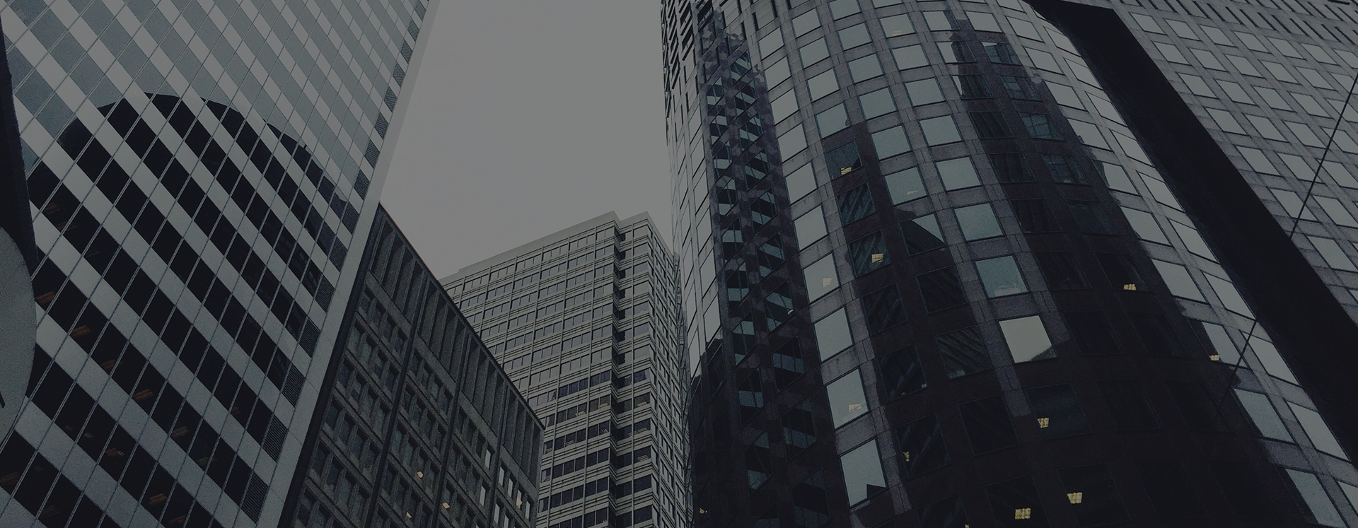
Header Element
The header element sits at the top of the website just below the navigation bar and is the first thing that the user will see when arriving onto the site. Text could be added over this image by inserting it into the HTML.
HTML
  <section class="hero">

    <img src="top-image.png">

  </section>
CSS
          .header {

            width:100%;

            margin:0 auto;

          }
Buttons
These are used around the whole of the website for call to actions and in forms. There are six different types of buttons for this website and can be seen below.
Rounded White (Bold)
Sign Up / Log InRounded Green
ApplyRounded White (Normal)
SearchRounded Green Border
Find Out MoreGreen Border
ContactWhite | Green Border
BackHTML
          <a href="#" class="button bold-rounded-white">Sign Up / Log In</a>

          <a href="#" class="button rounded-green">Apply</a>

            <a href="#" class="button normal-rounded-white">Search</a>

            <a href="#" class="button rounded-green-border">Find Out More</a>

            <a href="#" class="button green-border">Sign Up / Log In</a>

            <a href="#" class="button square-green-border">Back</a>
HTML
                      .bold-rounded-white {

                          background-color: white;

                          border-radius: 2em;

                          color: #27AE60;

                          font-weight: bold;

                      }


                      .rounded-green {

                          background-color: #27AE60;

                          border-radius: 2em;

                          color: white;

                          padding: 1em 2em;

                          font-weight: bold;

                      }


                      .normal-rounded-white {

                          background-color: white;

                          border-radius: 2em;

                          color: #27AE60;

                      }


                      .rounded-green-border {

                          border: 2px solid #27AE60;

                          border-radius: 2em;

                          background: none;

                          color: #27AE60;

                          text-align: center;

                      }


                      .green-border {

                          border: 2px solid #27AE60;

                          background: none;

                          color: #27AE60;

                          text-align: center;

                      }


                      .square-green-border {

                          border: 2px solid #27AE60;

                          background: #ffffff;

                          color: #27AE60;

                          text-align: center;

                      }


                      .button:hover {

                          background-color: #27ae60;

                          color: none;

                      }
Jumbotron
A jumbotron can be used at the top of a website much like a her section. This can be edited in the HTML and CSS and can contain any text in heading and sub heading form. A button is sometimes found on this component as well to lead the user to certain content.
HTML
                    <div class="medium-12 columns header">
 <h1 class="header-title">Welcome to Architectural Elite</h1>
 <h5 class="header-subheading">Lorem ipsum dolor sit
                    amet, consectetur adipiscing elit. </h5>
 <a href="#" class="button learnmore">Learn More</a>
</div>
CSS
                    .header {

                        background-color: #1d1d1d;

                        padding: 5em 4em;

                    }

                    .header-title {

                    color: #fff;

                    }

                    .header-subheading {

                    color: #fff;

                    }

                    .learnmore {

                        border: 2px solid #27AE60;

                        border-radius: 2em;

                        background: none;

                        color: #27AE60;

                    }
Footer
The footer is found at the bottom of the webpage and usually contains social media links and links to other pages on the website.
HTML
  <footer>

      <div class="row">

          <div class="small-9 columns footer-copyright">© Copyright Architectural Elite Ltd 2017</div>

          <div class="small-3 columns footer-social">

              <a class="social-link" href="https://www.facebook.com/architecturalelite/"><i class="fa fa-facebook fa-lg social"></i>

          <a class="social-link" href="https://twitter.com/archeliteuae"><i class="fa fa-twitter fa-lg social"></i></a>

              <a class="social-link" href="https://www.linkedin.com/in/hayleydyer"><i class="fa fa-linkedin fa-lg social"></i></a>

              <a class="social-link" href="https://www.youtube.com/user/ArchitecturalElite"><i class="fa fa-youtube fa-lg social"></i></a>


          </div>

      </div>

  </footer>
CSS
                      footer {

                          background: #27AE60;

                          color: #fff;

                          padding: 2em;

                          margin-bottom: 1em;

                      }


                      .social {

                          padding: 0.5em;

                      }


                      .social-link {

                          color: #fff;

                      }


                      .social-link:hover {

                          opacity: 0.6;

                          color: #fff;

                          transition: 1.0s ease-in-out;

                      }
Breadcrumbs
Breadcrumbs is a secondary navigation that reveals the location on a website. The color, font weight can be edited in the CSS code.
Architectural Elite > Job > Junior Architect
HTML
<h5 class="link-tag"><a href="#">Architectural Elite</a> > <a href="#">Job</a> > Junior Architect</h5>
CSS
      .link-tag {

          text-align: center;

          color:#27AE60;

          margin: 1em;

          font-size: 1em;

          color: #000000;

      }

      .link-tag a {

          color:#27AE60;

      }